
My logo started out as an R for Rosie. Then during my sketches in a summer holiday in Spain it became two Rs and they lost their “sticks”. The two stylized Rs developed and entwined to become the dancing figure in my logo. The two halves of the figure can also be seen to represent the two aspects of bilingual education: language and content. Or teaching and training. My figure also gained a head. A friend asked, “But where is the international aspect of your work, then?” So I changed the head into a globe – symbolic of the international nature of some of my work. One significant thing that influenced my decision to become an independent consultant was a dream that I had about a volcano. In the dream, I was hiking on the flanks of a beautiful volcano which started, of course, to erupt – dreams are like that. I ran away from the volcano (about 5 km in a few seconds, like you do in a dream, and watched it erupt from a safe distance. And enjoyed the lava and smoke, the earth’s energy exploding into a blue sky. Finally, the volcano exploded into a huge cloud of ash and lava. The light Interpret my dream as you will. The colours of the volcano became the colours of my logo. And you can see the shape of the volcano in the legs of my dancing logo.
|
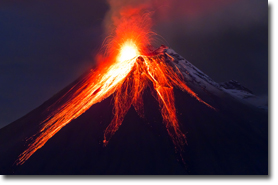 grey ash then descended gradually to the earth and landed in the shape of an enormous Buddha figure, etched against the blue summer sky. The ash Buddha sat, huge and serene, for a few seconds, then collapsed into himself.